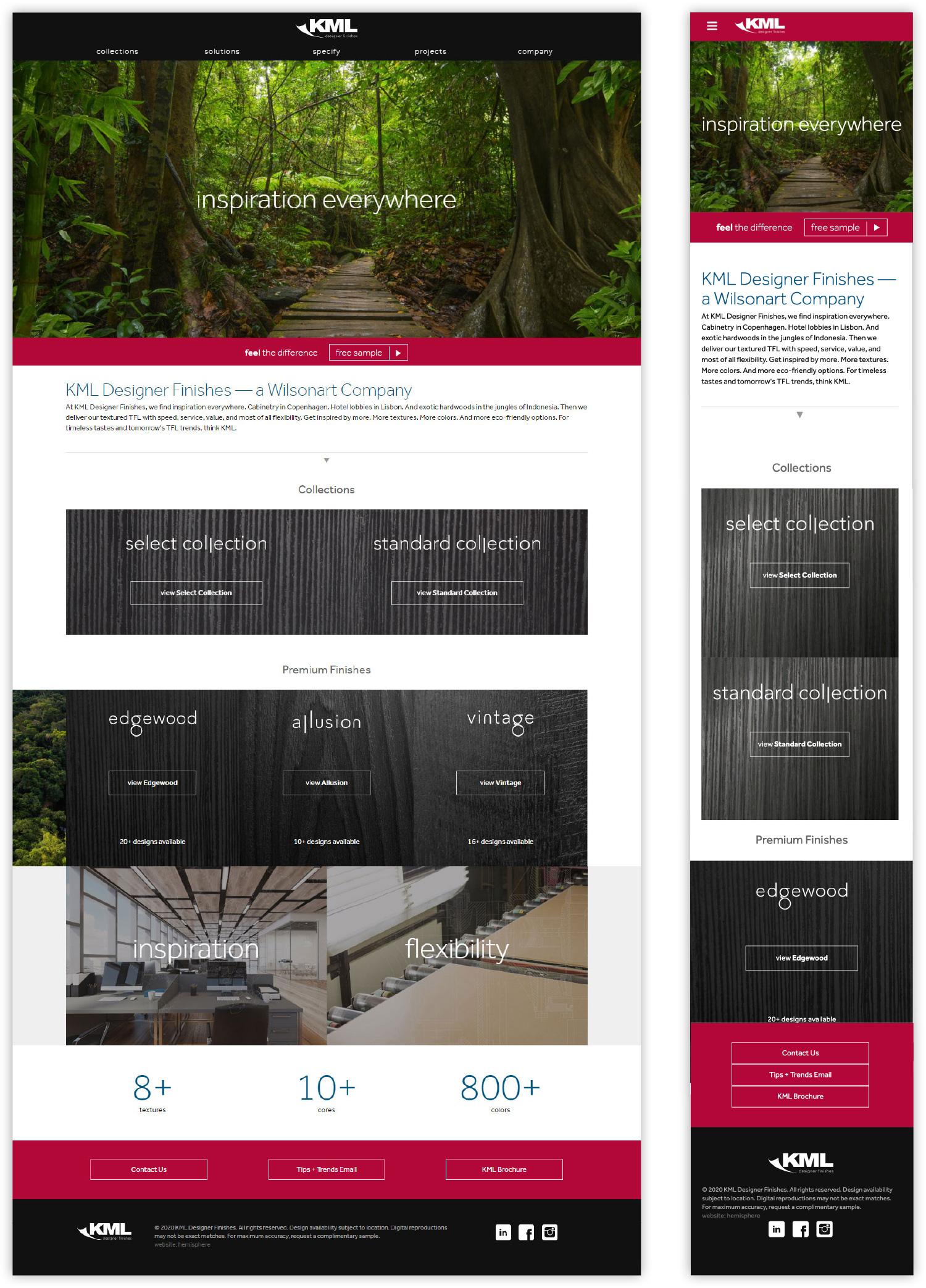

When KML came our way, they had a logo but a brand that lacked focus and refinement. Our mandate? Craft a unified brand that would appeal to the architecture and design community. As our relationship grew, we built KML an interactive website and took over design of their print ads, eNews, sales sheets, and more. The results? A rising profile that helped attract Wilsonart, a multi-billion dollar buyer.
— On this Page —
We cleaned up KML's logo and integrated our branding approach with Wilsonart's house of brands. We've also crafted a number of memorable brand messages, including the latest — Inspiration Everywhere — which reflects KML's natural inspiration and eco-friendly approach.
The toughest part of selling laminate is helping designers get a feel for the product so they'll order samples. We designed a site that excites with subtle video elements, animation, and images that inspire design possibilities. We paired all of this "pretty" with smart SEO. Result: more eyes on KML.

For KML's Christmas-season launch of the Select Collection, a group of its most popular wood-inspired panels, we made a video that emphasized how KML can be made from 100% recycled wood. We followed this up with simple videos that celebrate KML's wood texture close up.
We created print collateral and sample chains to help designers get excited about the inspiration behind and the execution of KML's high-end, eco-friendly products. From embossed textures, to heavy high-quality paper, these pieces reinforce the elegance of the product.
In the past, KML photography was one dimensional. Laminate designs in swatch boxes. Accurate but boring. Our photographer paired KML panels with Instagram-worth decor pieces and captured the product from interesting angles. Viola! Visual vitality.
We brought the theme of "inspiration everywhere" into KML's email marketing, rooting KML's communication about its products in design trends to improve engagement and visual excitement.
