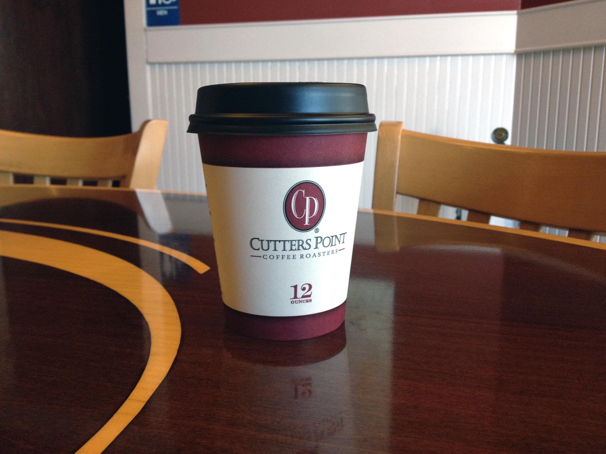
It started with helping Cutters Point identify something about their brand. Simply selling fine coffee wasn’t enough. They wanted to inspire meaningful, adventurous living — and they needed a look that supported this goal.
— On this Page —
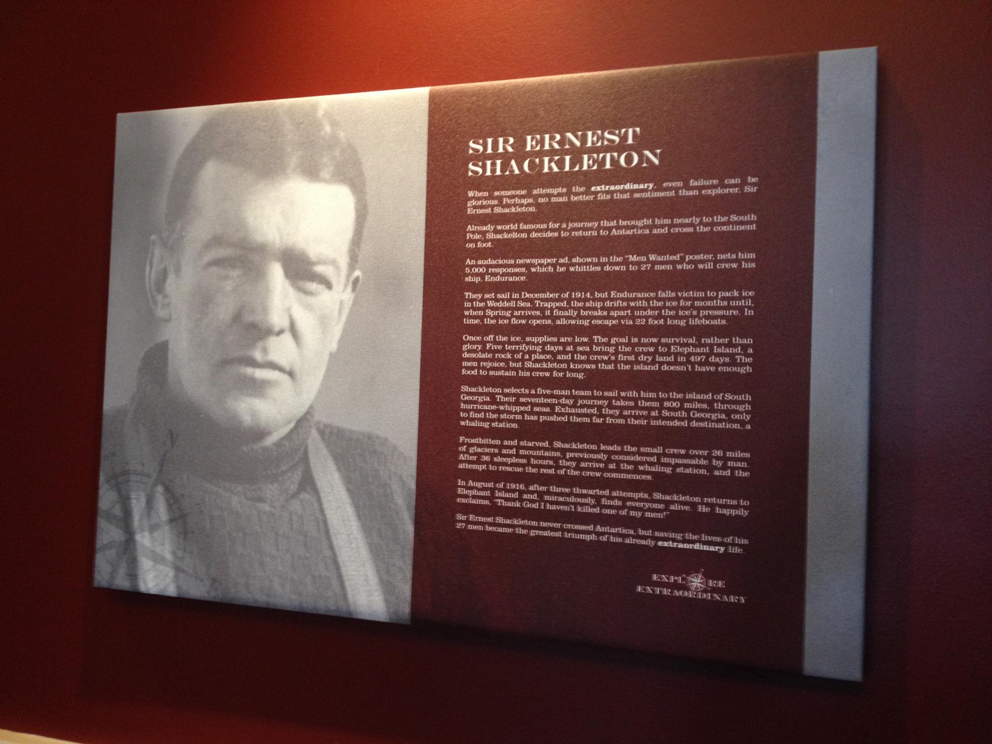
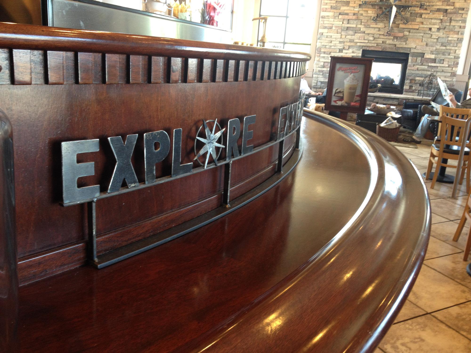
After years of supporting Cutters Point with graphic and web design, they asked us to help them re-imagine their look, feel, and ethos at one store. We jumped in with ideas, posters, environmental graphics all centered around one big idea. A new tagline: explore extraordinary. This dual-purpose phrase was at once a call to live an extraordinary story and at the same time an invitation to explore exceptional coffee. This tagline and ethos helped inspire a rebrand by another agency that updated the Cutters Point logo and brand.
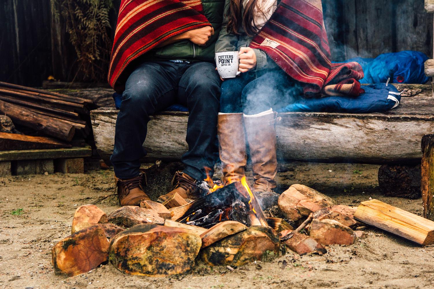
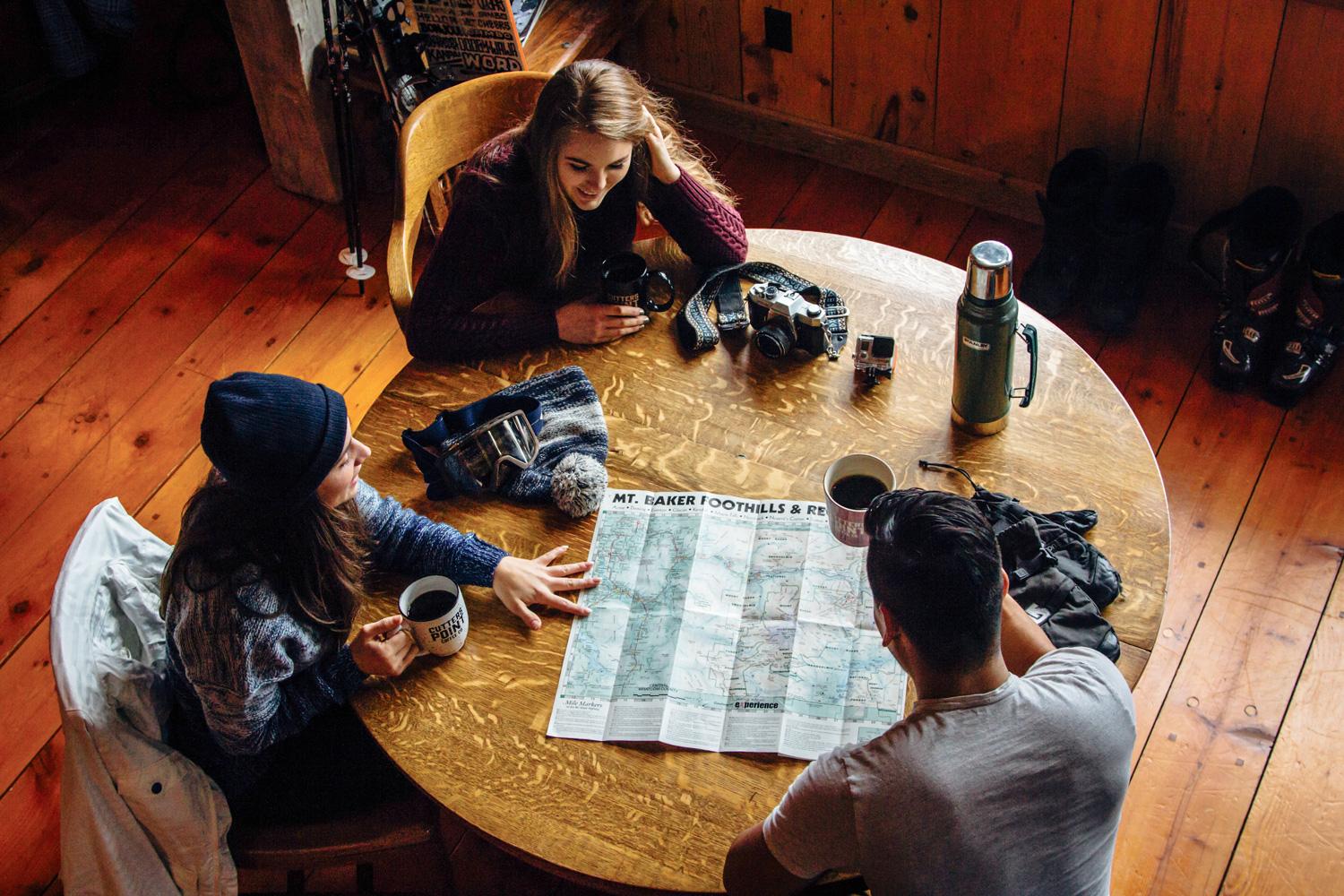
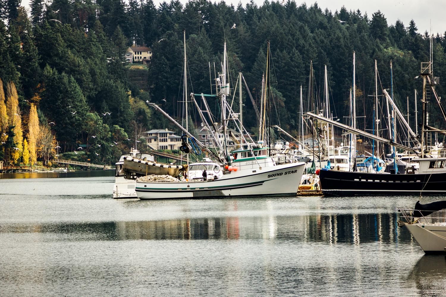
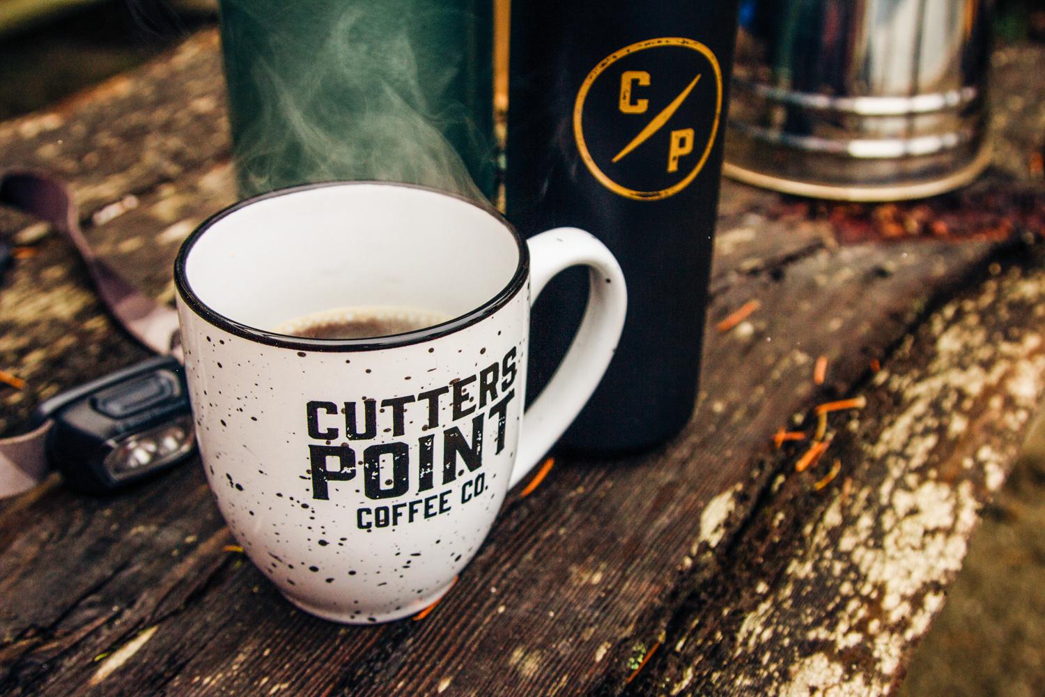
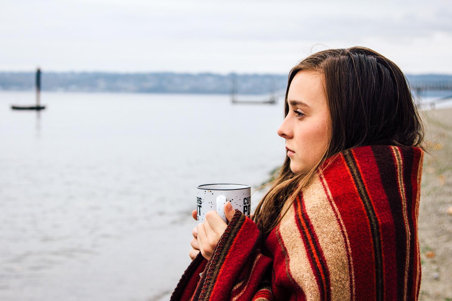
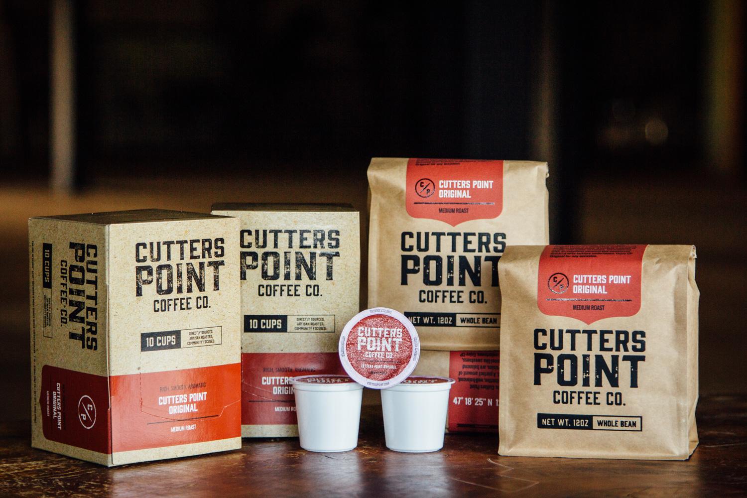
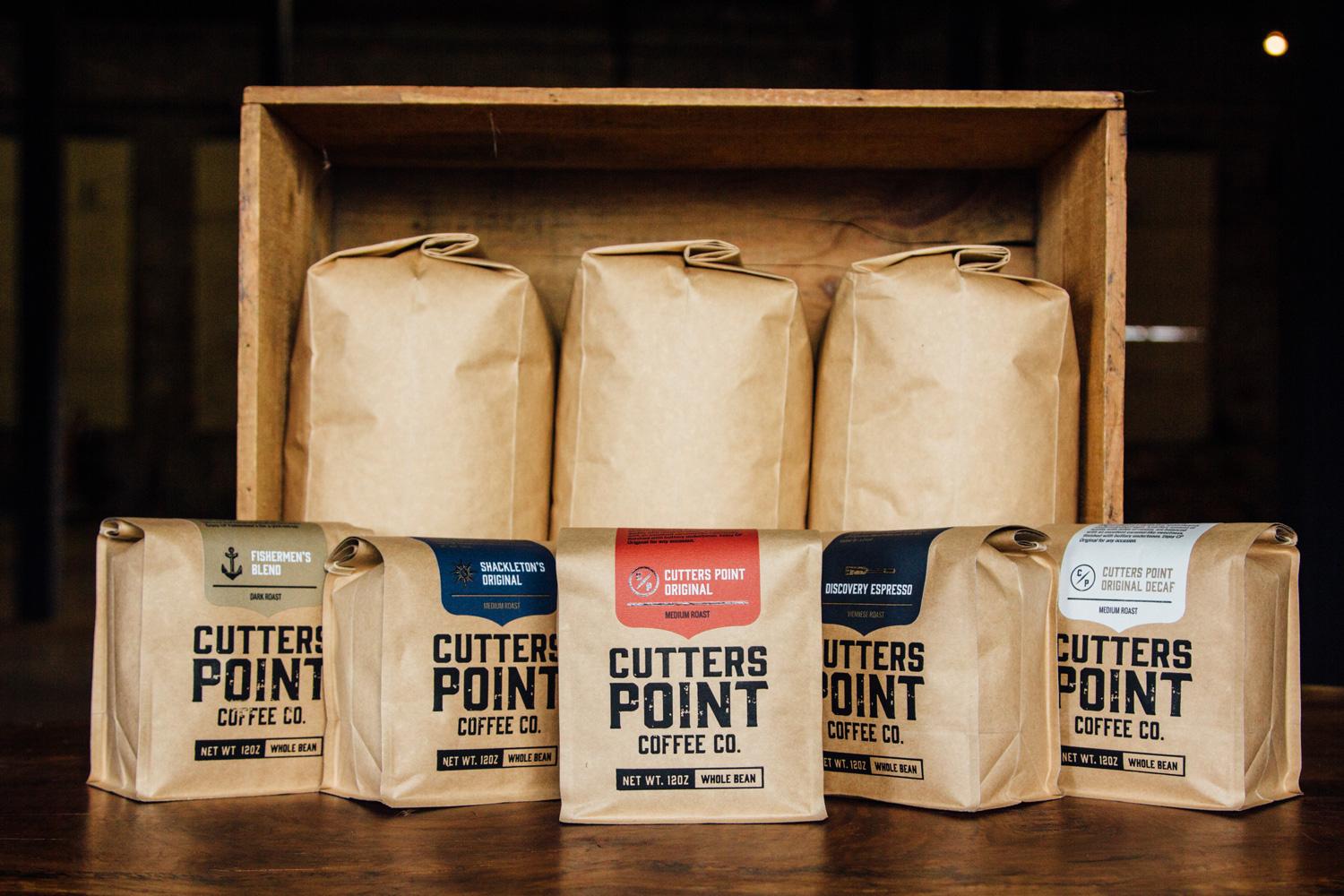
We collaborated with Cutters Point on a shot list, cast a few models, and set up scenes that helped evoke the sense of outdoor adventure that was at the heart of the new brand. Our photographer captured candid scenes working with models, CP merchandise, and real locations. We also shot traditional white seamless photos and product photography for the web store. Our photography brought the website to life and provide the client with a photo library for ongoing marketing.
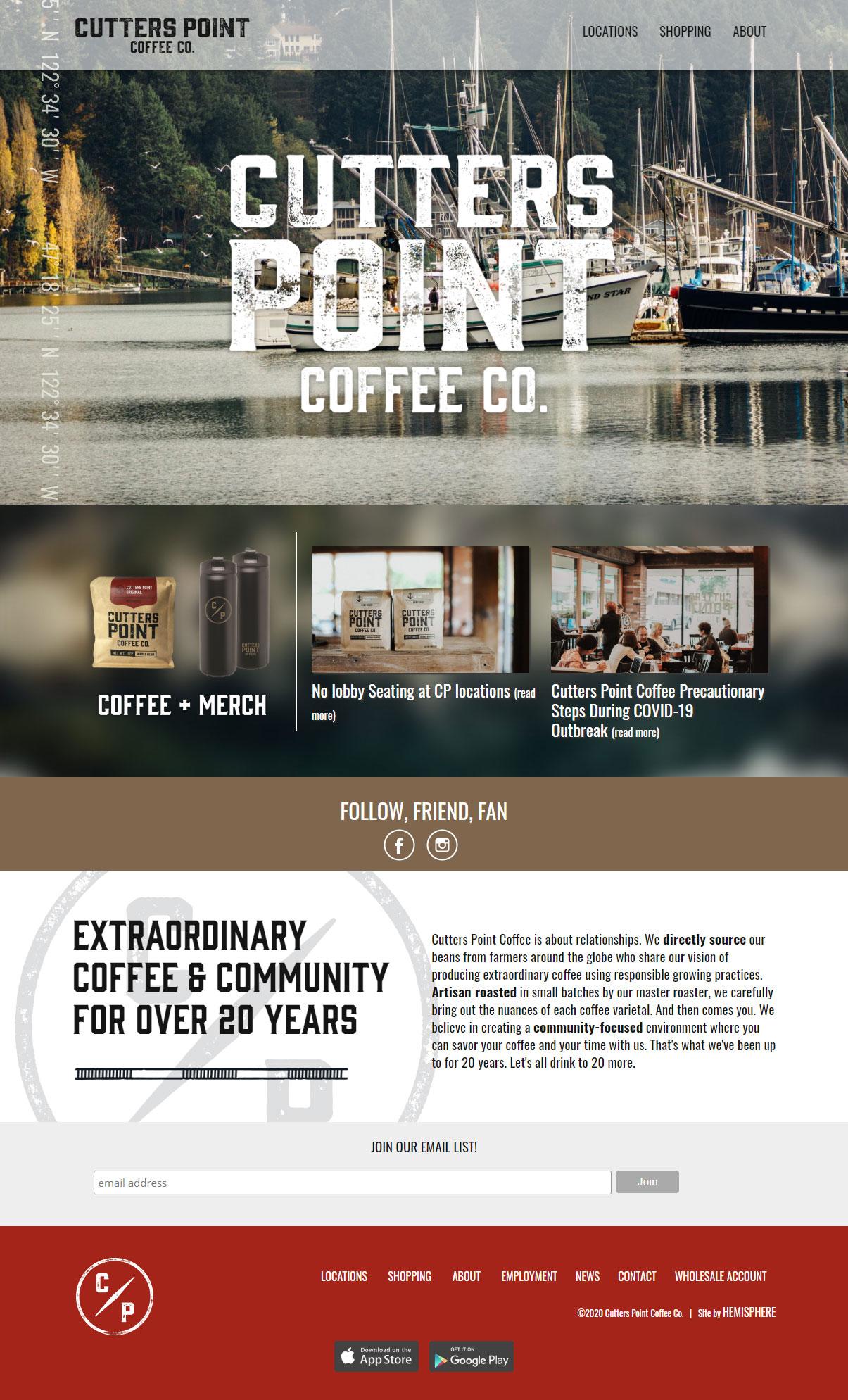
With a new adventure-inspired brand to play with, we felt the new Cutters Point website needed to feel raw, exciting, and rooted in place. We designed and developed a mobile-friendly site that allowed rustic, local, and authentic imagery to reinforce CP's adventure-oriented brand. Data drove our writing and content strategy, helping us create a search-engine-friendly site with robust e-commerce and intuitive navigation.
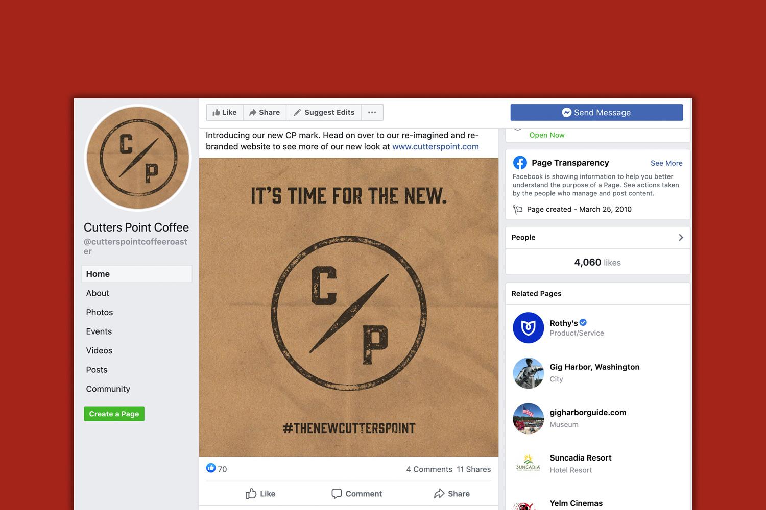
As the website wrapped up, we helped Cutters Point on a few more crucial pieces — packaging for their brand new K-cups, a brand rollout strategy, and the social media imagery needed to debut their new brand and website to the world. Our rollout centered on a series of images gradually building to the new CP "compass" logo. The text for the rollout helped reclaim an under-told part of their story, that CP ethically sources and roasts their own high-quality coffee. Note: coffee bags by another agency.